Posts

Difference between Elliott Wave and Gann Analysis

Image
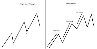
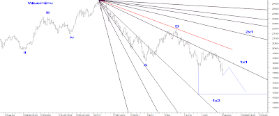
Elliott wave Principle and Gann analysis both are different and unique. Thus both technical theories work very well in today’s market. Here we will not see the practical application of the theories but the difference between them 1.     Elliott Wave Principle says that in an impulsive wave there should be 5 waves in which 3 waves decide the market direction and 2 waves are just the reaction. Whereas Gann analysis says that in order to know the trend of the market on the upside there should always be 3 section more than 3 section can be utilized as an opportunity to create short positions. From the above chart we can come to a conclusion that more than 3 section will suggests that the trend of the market is not going to sustain and there are high chances for the market to reverse. This is one of way to catch a top or the bottom.

Nifty Mid Cap to move till 1550

Image
Nifty Mid Cap is moving in a down trend by forming a lower high and a lower low formation. On 31 st of July 2013 prices broke its crucial support of 1802 and moved lower till 1722 as on 2 nd August 2013. This clearly suggests that prices are negatively poised and has the tendency to move lower. To justify our view we have used advance technical tools to find out the desired support and resistance of this index. We have used Gann Fann and have placed it on the top made on 9 th January 2013 from there on prices have moved below 1x1 line which is a very crucial to identify the support and resistance. Currently prices are below this line which clearly suggests that it is facing the resistance of this line. As far as prices move below this our favored view for this particular index is negative and can move lower till 1550 levels. Nifty Mid Cap Daily Chart We will not be publishing the method to forecast in this article

Infosys: Predicting through Gaps

Image
It is very essential to know the range of a particular Index, stock or commodity for trading perspective. In Infosys we can come to know that the stock was moving in a big range of 3000-2100 from past 2 years. Many analysts believe that such a rise in IT sector is due to US Dollar getting strong, but if this was the case how can we manage to know that Infosys is going to break its upper extreme that is 3000. In our previous article we were very accurate in mentioning the level of this stock as it can move till 2800 when the stock was quoting at 2400 levels. This time we have come out with advance technicals such as Gann Analysis to predict the level for this IT stock. Infosys: Daily Chart Analysis From the above daily chart we can observe that prices have take out its previous high of 3000. This is an important high as prices were moving in a range of 2100-3000 from past 2 years. We have predicted the

Nifty: Using Square of 9 Technique

Image
We have been accurate in capturing the move of Nifty when it whipsawed from the 5600 and later opened with a gap up which was unfilled. We captured the trend only with the help of advance technicals such as Gann analysis and its master calculator Square of 9; again we used simple technicals such as channels, retracement to predict the support and resistance for this index. Other oscillators such as Daryl Guppy has given a buy signal along with moving average of 20 EMA and 50 SMA has given a bullish crossover which opens positive possibilities for this index. As far as 5905 is protected on downside our bias continues to be positive for Nifty. Using square of 9 technique we found the date where the trend of Nifty changed which we have explained below. The below chart explains the use of square of 9. Nifty Daily Chart Analysis Nifty made a low on 10 th of April 2013 at 5477 and then it moved higher and made a high of 6229 on 20 th May 2013. To predict the fut

Nifty: Calculation through Time

Image
Nifty has completed first section and is now heading towards its second. It is always easy to remember like this to avoid confusion. As we are aware that there are only 3 section, a possibility of 4 th will either make a double top or any other formation which will help us to initiate fresh position. We have used Square of 9 technique which is a master calculator in identifying the change in trend, its swing and change of date. We have shown this in the chart where we have come to the conclusion that Nifty can rally further till 1 st Of August 2013. Also we have used speed angles to justify our self that how much price can move higher with the help of this angle. Analysis: As mentioned above after completing section 1, the index is moving in section 2 which proves that it has ample of space to rally further. Second most important thing is we have calculated Price with time again a very important indicator to foresee the change in trend. This was only possible with

Gold: Double Bottom Breakout

Image
Many traders and analysts are not clear for the trend in Gold, but looking at the current chart of Gold prices will now move in a positive direction over short term. We have been continuously watching this precious metal and came to the conclusion that prices will start its up move. This was only possible with the combination of simple technical analysis and advance analysis. The following excerpt is been picked from our daily publication “Commodity Gannalyst” where we had mentioned its crucial support and resistance levels. Gold 1 st Month Contract Analysis From the above chart we can observe that after a sharp fall from 32500 prices came down steeply and found support near 25000. Prices managed to protect its low of 25000 and bounced thus giving and double bottom break out. After the break out prices managed to stay above it which opens positive possibilities and started consolidating by movi

IDFC : How to identify change in trend?

Image
IDFC was one of the worst performer stock but what was the signal that forced the stock to change the trend? The answer to the above question was only possible with help of advance technicals like Gann Analysis and simple technical analysis such as channels, Fibonacci retracements etc.  IDFC Daily Chart   Analysis:                             From the above daily chart we can observe that prices are moving in a down trend but in the 1 st week of June prices showed a reversal pattern. We have also used price and time grid to find out the change in trend. Price and time grid is very important not only to find out change in trend but also helps us to determine important support and resistance levels.